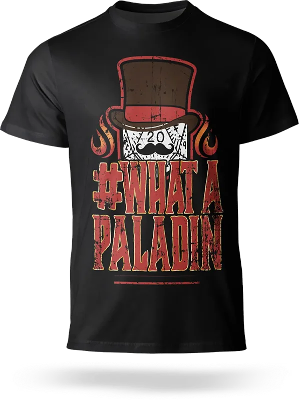
Dice Company Podcast Merchandise
These official Dice Company Podcast t-shirts started as fan art and were later adopted as official merchandise—now available for purchase at Dice Company Podcast Merch. https://dicecompanypodcast.com/merch/ Each design incorporates bold, distressed typography and thematic D20 dice illustrations, capturing the energy and personality of the podcast’s fan-favourite moments. The designs balance vibrant colours, fantasy elements, and intricate details, making them perfect for tabletop RPG enthusiasts. (Full transparency: I receive a percentage of each sale.)

Velora M. Levy-Sailsman Book Launch Event
For the book launch of "Autism – One Family’s Journey: A Boy Called Zeke", I designed a cohesive set of promotional materials to create a professional and memorable event experience. This included: Event banners and leaflets – featuring a clean, structured layout for key details and visual consistency across all materials. Commemorative mugs – designed with the book’s branding to serve as meaningful keepsakes. Printed pendants – incorporating the book cover for a personal touch and lasting memento. The design approach maintained elegance, clarity, and emotional resonance, ensuring a strong visual identity for both the event and the book's promotional campaign.
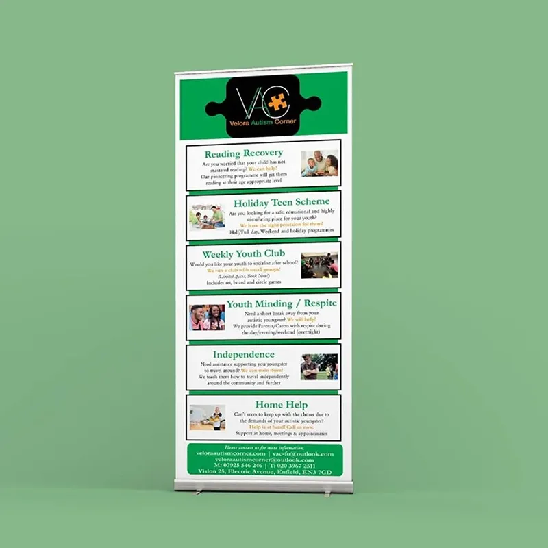
Velora Autism Corner Roll-Up Banner
For Velora Autism Corner, I designed a clear and structured roll-up banner to showcase their services at events and outreach programs. The green and white colour scheme reinforces a sense of trust and calm, while the puzzle piece motif subtly ties into autism awareness. A hierarchical layout ensures easy readability, guiding viewers through key services at a glance. This design helps VAC make a strong, professional impression while effectively communicating their mission.
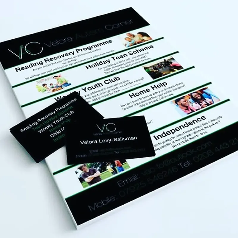
Velora Autism Corner
For Velora Autism Corner, I designed a cohesive set of business cards and leaflets that maintain a clean, professional, and informative layout. The design uses a structured hierarchy, ensuring clarity while highlighting key programmes and services. The black, green, and white colour scheme reflects professionalism while maintaining a sense of warmth and approachability. The result is a polished and effective print package that strengthens VAC’s branding and outreach efforts.