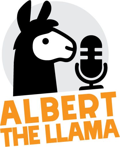
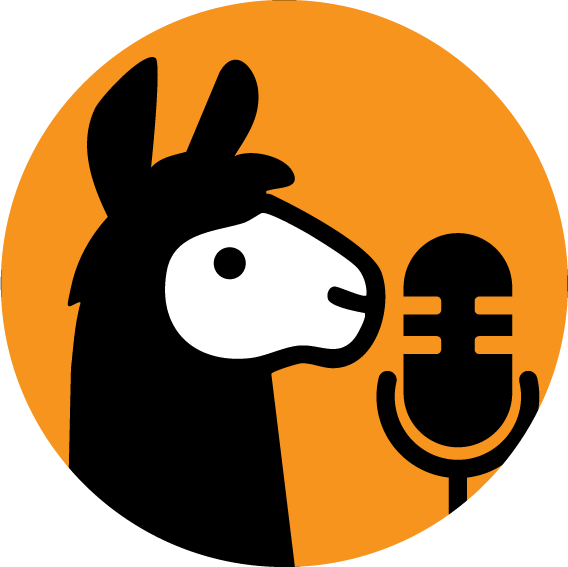
Albert The Llama
Albert the Llama Enterprises is a new umbrella identity for a growing family of actual-play TTRPG podcasts, bringing multiple shows together under one clear, recognisable banner. The key challenge with this project was flexibility. The branding needed to work just as well as a full logo on a website or Patreon page as it did at very small sizes for social media and Discord. To solve this, the identity was designed as a two-part system: a primary logo with text for formal use, and a simplified icon-only version optimised for avatars and social platforms. At the heart of both versions is a stylised llama paired with a microphone, clearly signalling podcast production while keeping the mark friendly and distinctive. Strong silhouettes, high contrast, and minimal detail ensure the logo remains legible and recognisable across all platforms, including dark mode and small-screen use. The result is a clean, characterful identity that’s built to scale — capable of growing alongside new shows while remaining instantly identifiable wherever it appears.
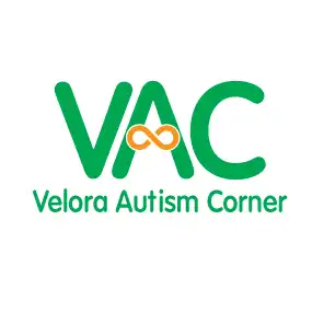
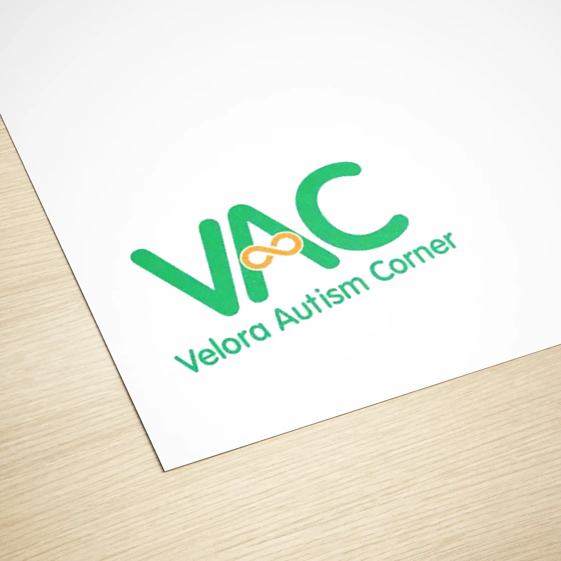
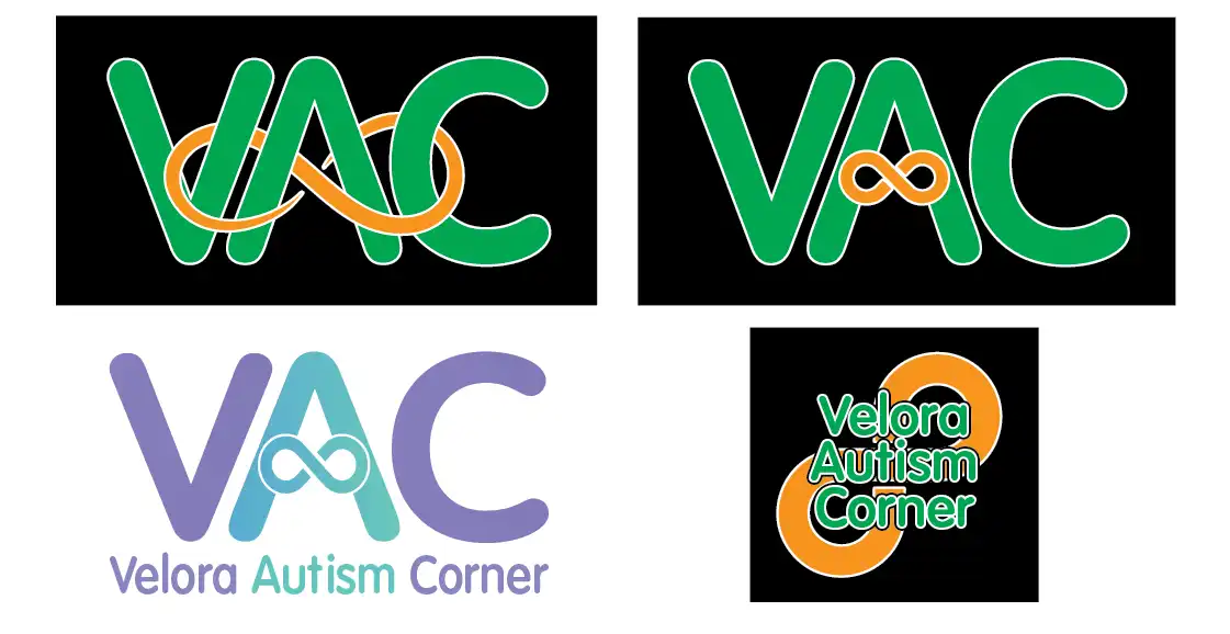
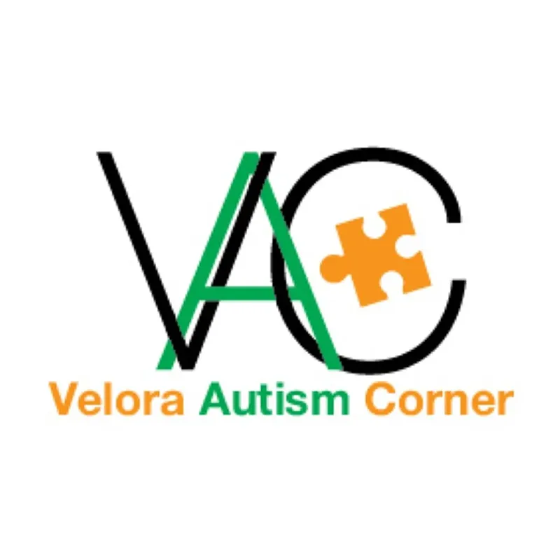
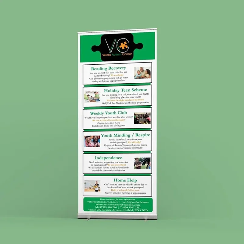
Velora Autism Corner (Rebrand)
Velora Autism Corner approached me for a full logo update that better reflects the modern autism community. Their original branding used the traditional puzzle piece, but as the community has shifted toward the infinity symbol — representing neurodiversity, identity, and inclusivity — it was the right time to evolve the visual identity. I began by exploring several design directions, experimenting with different ways to integrate the infinity symbol into the “VAC” initials while keeping the logo friendly, clean, and instantly recognisable. These early concepts were presented as a set of options so the client could see a range of styles and colour approaches before choosing the one that best represented their message. From those concepts, we arrived at the final logo: a fresh, modern wordmark with the infinity symbol seamlessly woven into the A. It keeps the welcoming feel of their previous identity while updating it with a symbol that aligns with current advocacy and values within the autism community. The result is a logo that honours where Velora Autism Corner has been — and clearly represents where they’re going.
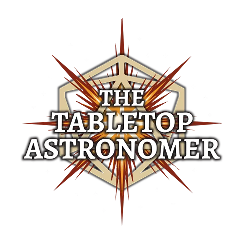
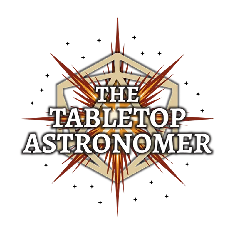
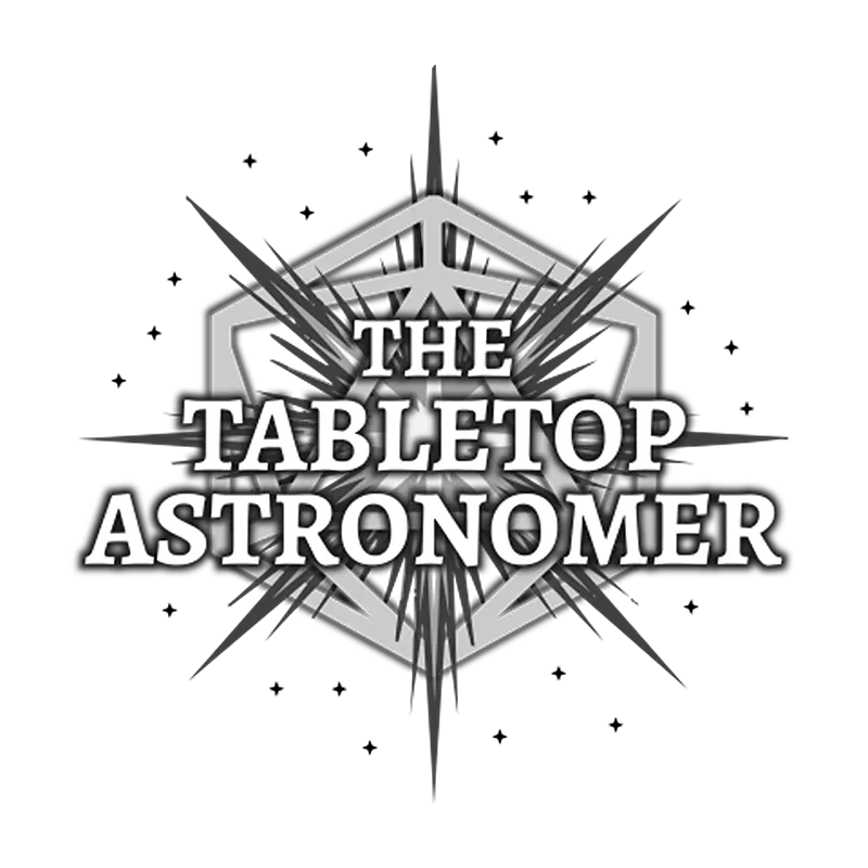
The Tabletop Astronomer
This logo was created for The Tabletop Astronomer, an independent TTRPG developer with a background in academic astronomy and space sciences. The client requested the inclusion of a distinctive starburst—which they provided—and this became the focal point of the final logo. A golden hexagonal frame anchors the design, referencing both tabletop dice and stellar geometry, while radiant starburst lines burst outward, symbolising discovery, cosmic wonder, and creative expansion. The typography is clear and elegant, balancing scientific precision with fantasy flair, reflecting the blend of astronomy and tabletop storytelling at the heart of the brand. This identity was also adapted into multiple versions for print, web, and grayscale reproduction, ensuring consistency across all formats.
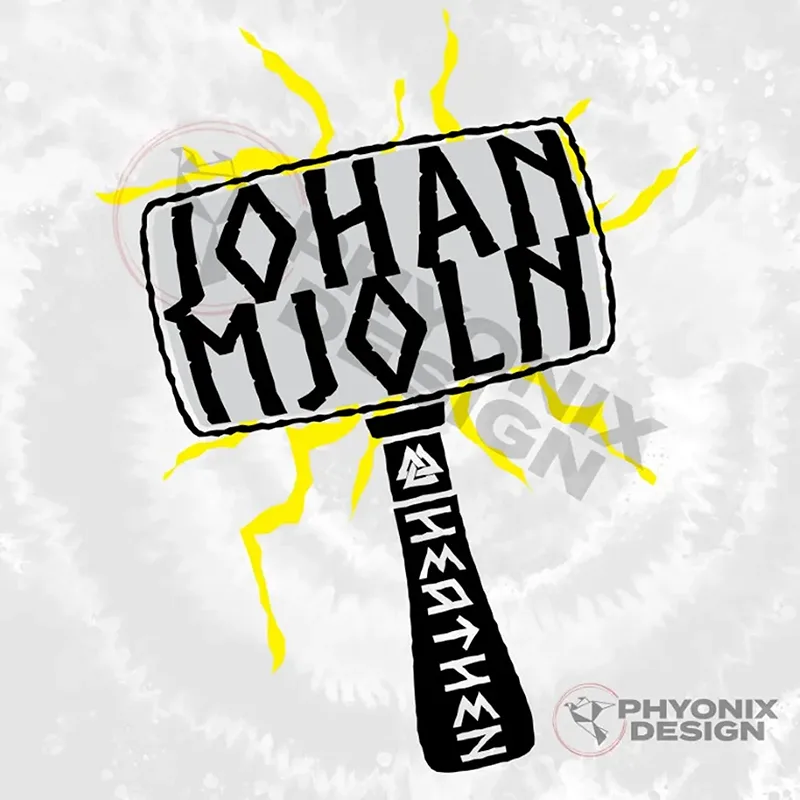
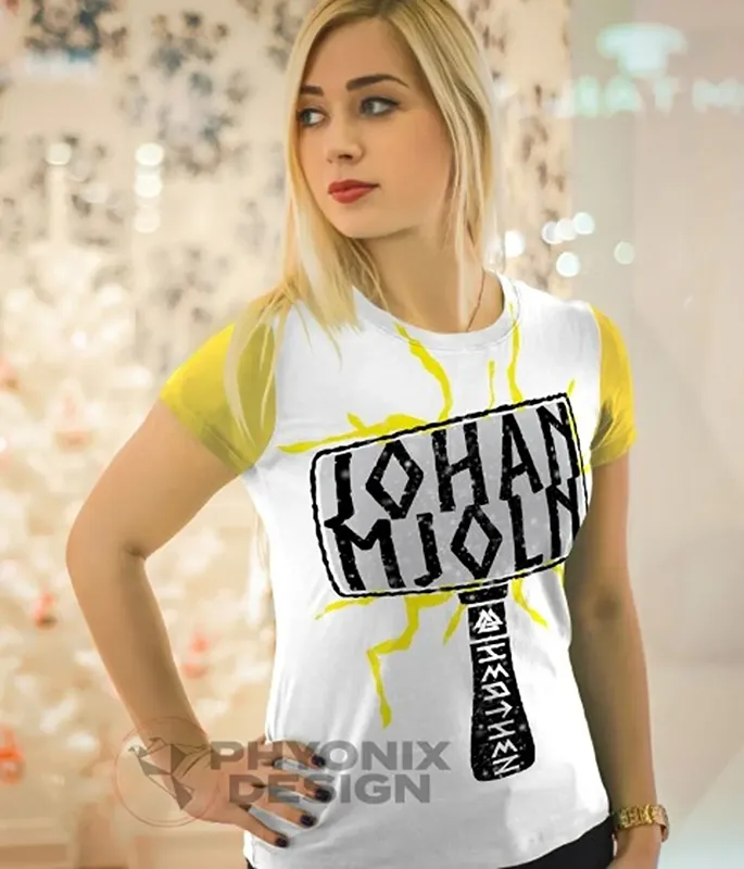
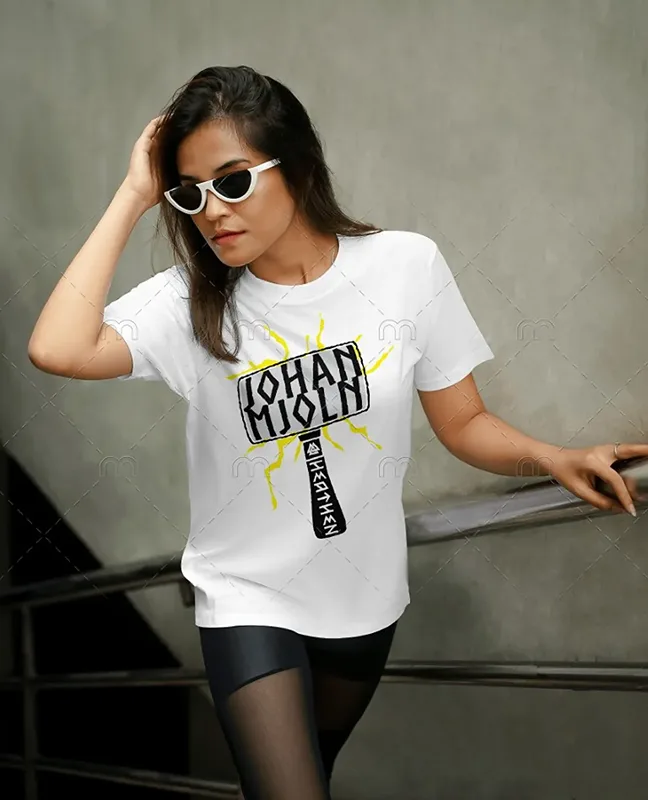
Johan Mjoln
his logo for virtual wrestler Johan Mjoln was inspired by Mjolnir, the legendary hammer of Norse mythology. Designed for use on Twitch and wrestling-themed merchandise, the logo features bold, rune-like typography, jagged edges, and lightning bursts, symbolising power, strength, and Viking heritage. The rough, hand-drawn aesthetic enhances the raw energy of the character, making it a striking identity for digital branding and apparel. This design ensures instant recognition and impact, fitting perfectly into the world of virtual wrestling.
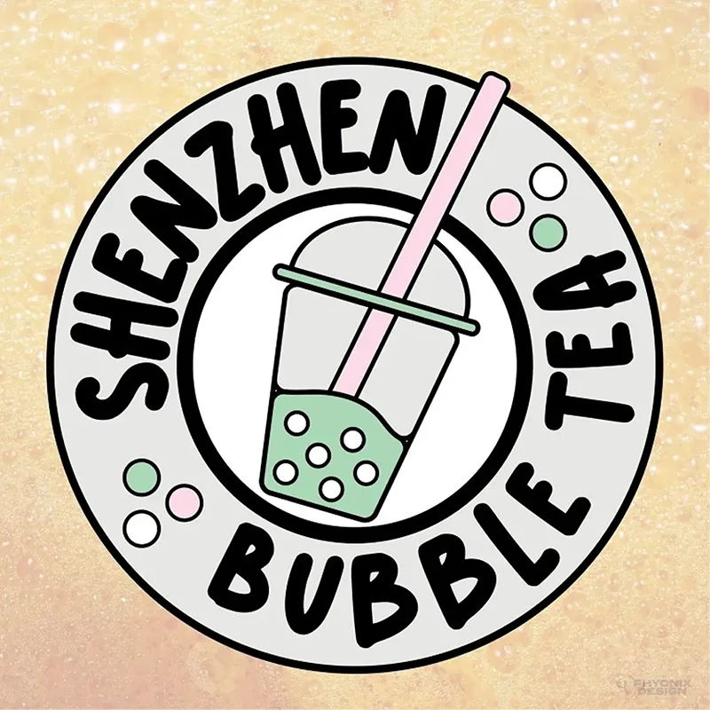
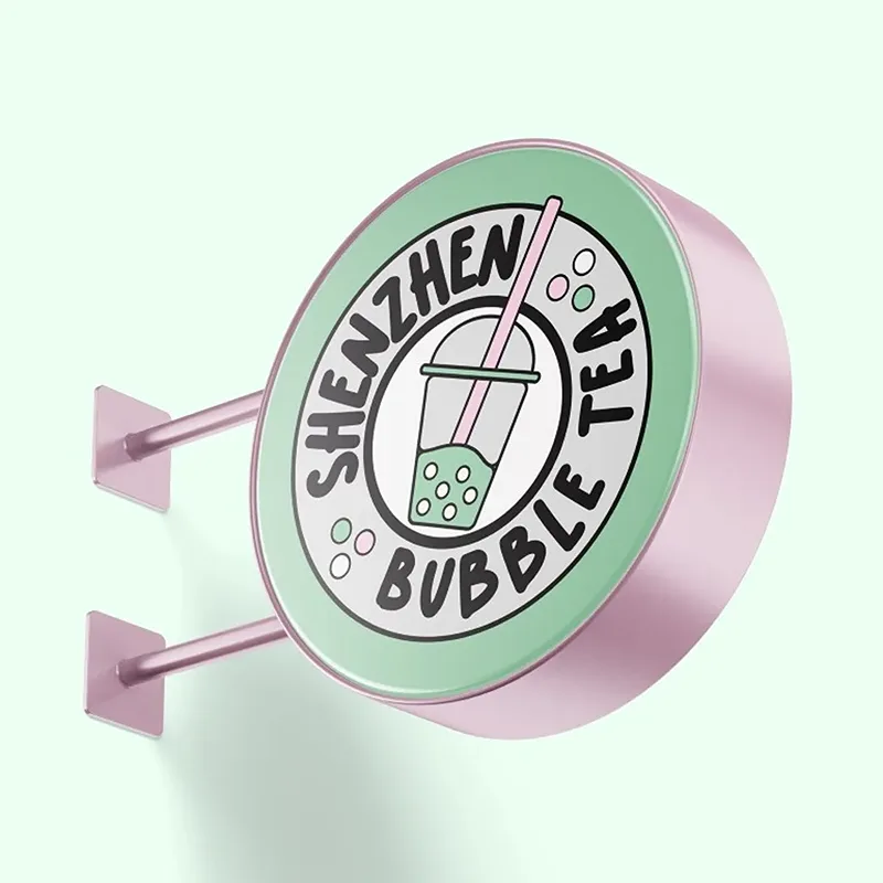
Shenzhen Bubble Tea
Shenzhen Bubble Tea needed a friendly, recognisable logo that clearly conveyed their brand at a glance. I designed a simple yet playful bubble tea icon, ensuring easy visibility from a distance while keeping a welcoming and family-friendly feel. The soft pastel colours reflect the variety of flavours, and the logo can be adapted to represent different drink options on their menu. This design balances fun and clarity, making it perfect for signage, menus, and branding across their growing chain of kiosks.
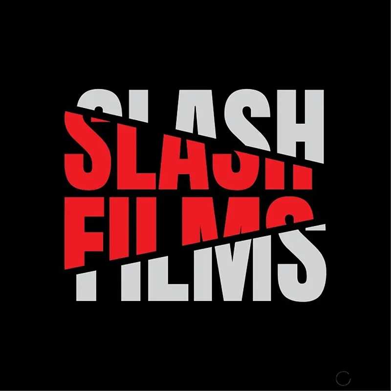
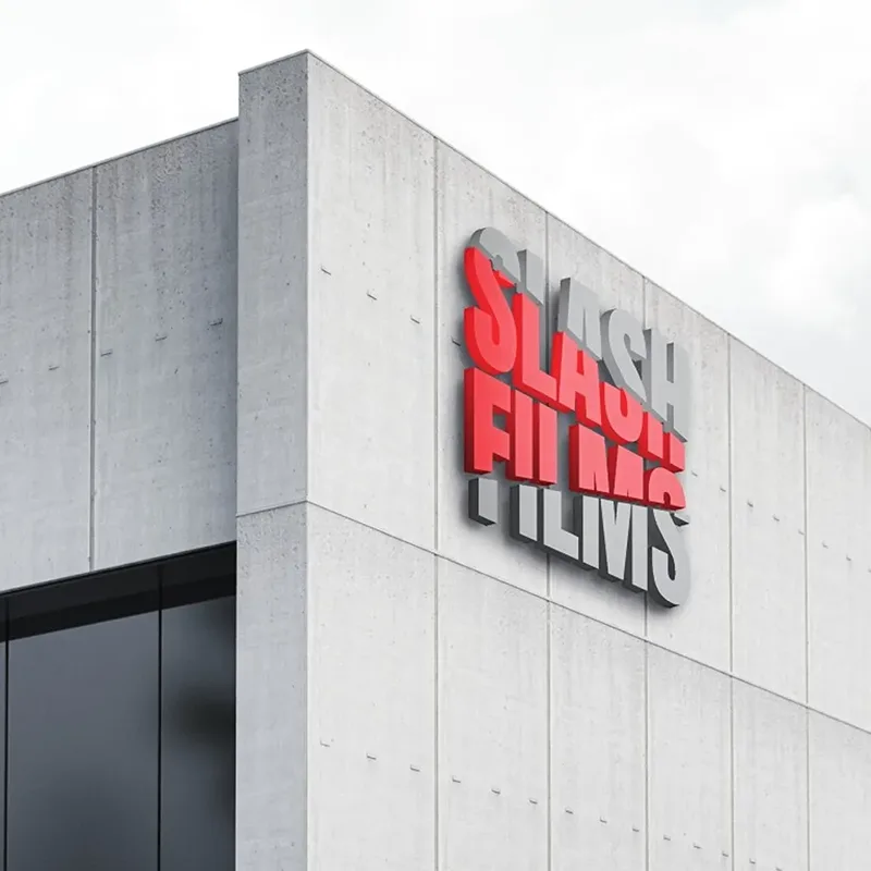
Slash Films
Slash Films, a provider of high-quality camera equipment and props for film productions, sought a bold, thrilling visual identity that would set them apart from competitors while maintaining a professional image. The challenge was to create a dynamic logo that conveyed excitement and cinematic energy without relying on overtly violent imagery. For this design, I used sharp, angular cuts through the typography to symbolize the action-packed nature of the industry while keeping the text legible and striking. The combination of red and gray reinforces the brand’s boldness, with red evoking passion and energy, while gray provides balance and professionalism. The slashed effect gives a sense of movement, making it perfect for use on business cards, rental equipment stickers, and film credits. This logo successfully captures the thrilling essence of Slash Films while ensuring a clean, recognizable identity across different applications.
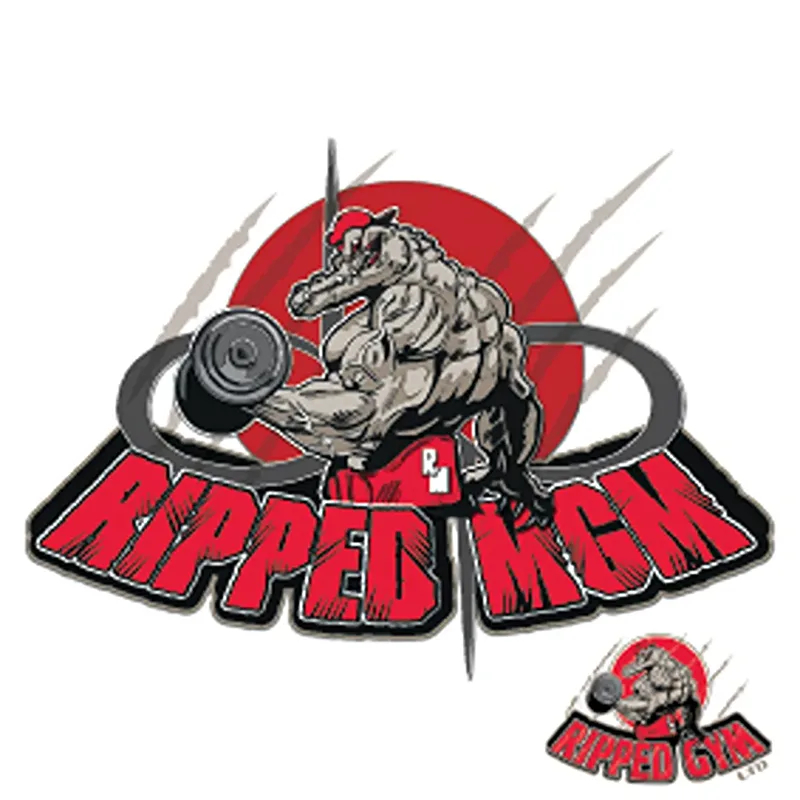
Ripped MGM Logo Redesign
The Ripped Gym logo has been redrawn and updated to reflect its new identity as Ripped MGM. The refreshed design maintains the bold, high-energy aesthetic of the original while refining details for a sharper, more dynamic look. With a muscular alligator mascot, intense typography, and a striking red and black colour scheme, the new logo keeps the gym’s hardcore brand intact while reinforcing its evolution.
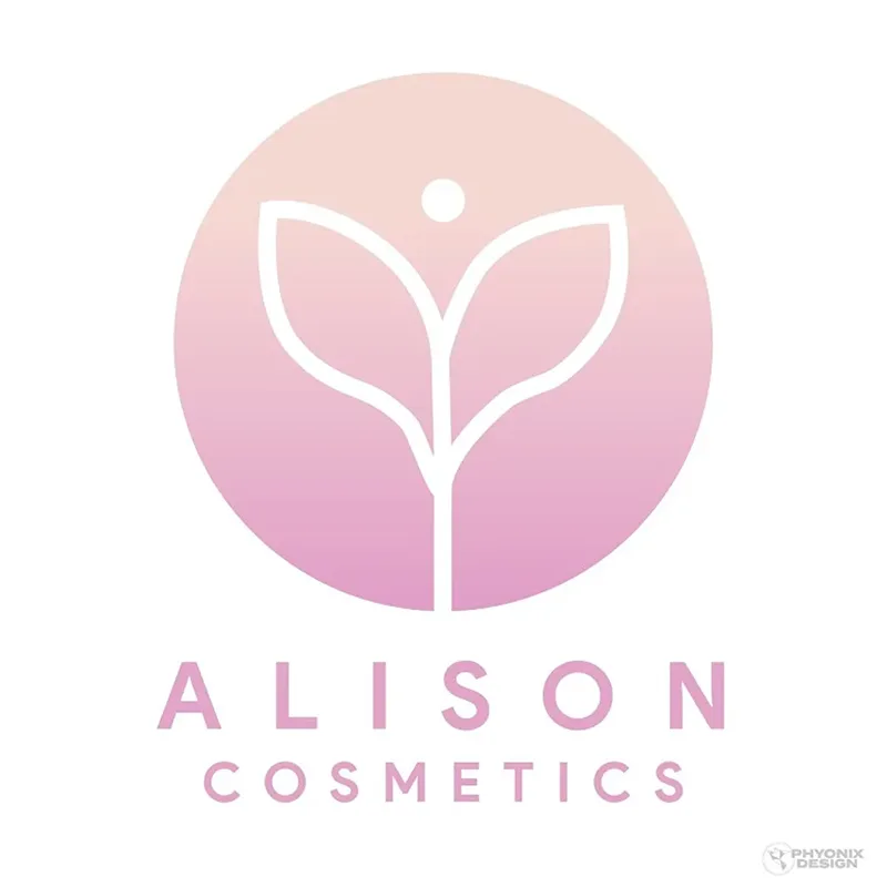
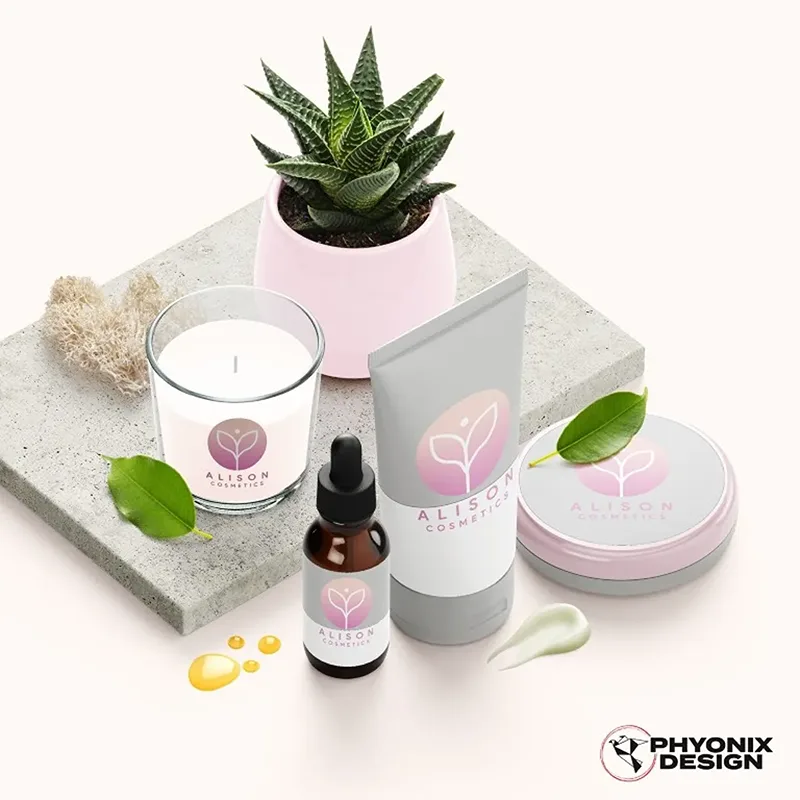
Alison Cosmetics
Alison Cosmetics needed a sleek, modern logo that reflects their vegan beauty brand while maintaining clarity across various applications. I designed a minimalist floral icon, symbolising natural beauty and skincare, paired with a soft pink-to-purple gradient to match the brand’s aesthetic. The typography is clean and bold, ensuring legibility on packaging, social media, and engraved product surfaces. This logo enhances brand recognition while maintaining a refined, elegant look for Alison Cosmetics.
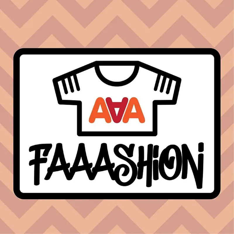
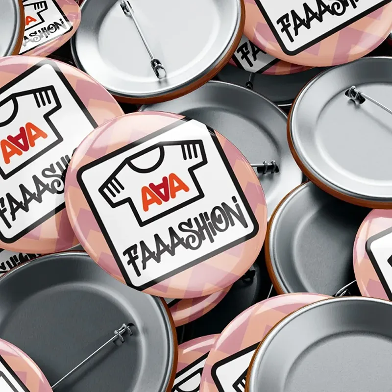
Faaashion
Faaashion needed a bold, streetwear-inspired logo that could be easily adapted into merchandise like enamel pins. I created a strong, structured emblem featuring a stylised t-shirt icon and expressive typography to reflect the blog’s focus on modern and urban fashion. The limited three-colour palette ensures smooth manufacturing while maintaining visual impact. The enclosed rectangular frame provides a solid, pin-friendly shape, making the design practical for production while keeping the brand’s edgy, trend-focused identity intact.
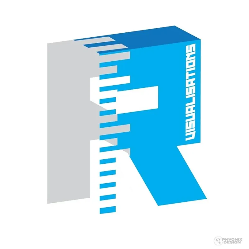
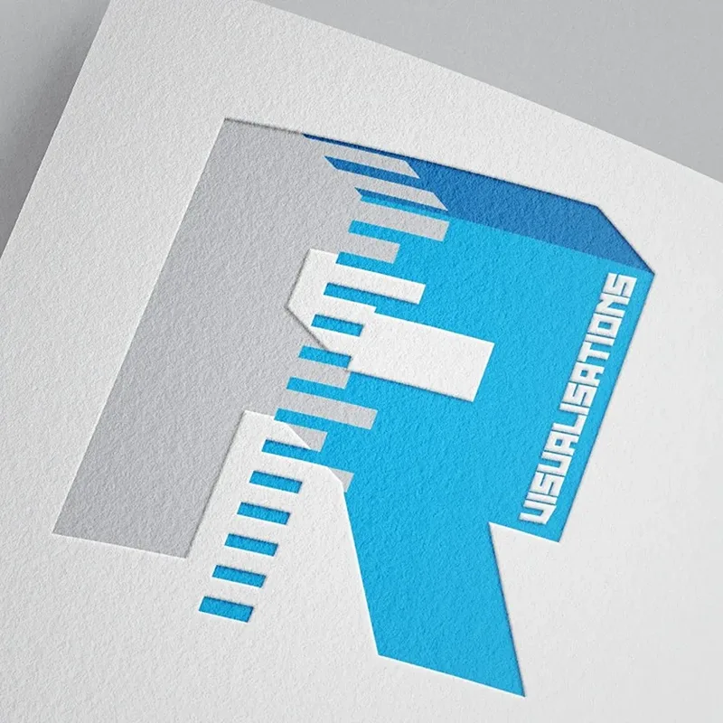
R Visualisations
R Visualisations required a modern, sleek logo that reflects their expertise in 3D architectural rendering and engineering integration. I designed a dimensional letter “R”, using a split and layered effect to symbolise depth, perspective, and digital modelling. The clean blue and grey colour palette represents technology, trust, and precision, aligning with the firm's architectural focus. The structured yet lightweight design conveys innovation and professionalism, making it a perfect fit for branding in VR, digital media, and real estate visualisation.
Velora Autism Corner
This logo for Velora Autism Corner was my first freelance project, making it a particularly special piece in my portfolio. The design features clean, modern typography, with the puzzle piece symbolising autism awareness and support. The green and orange colour scheme conveys growth, positivity, and inclusivity. This logo represents a welcoming and supportive space while maintaining a professional yet heartfelt aesthetic.
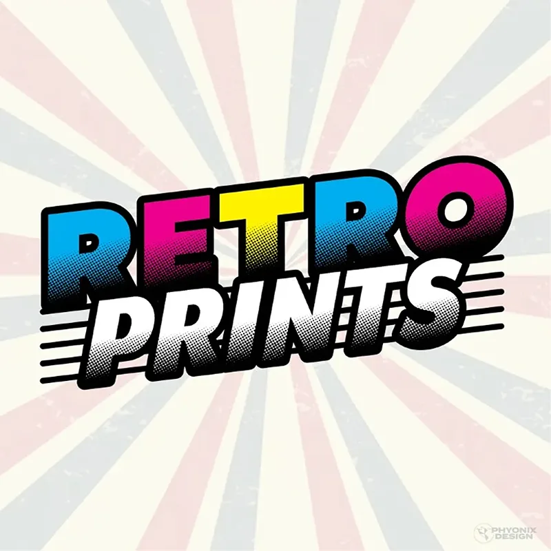
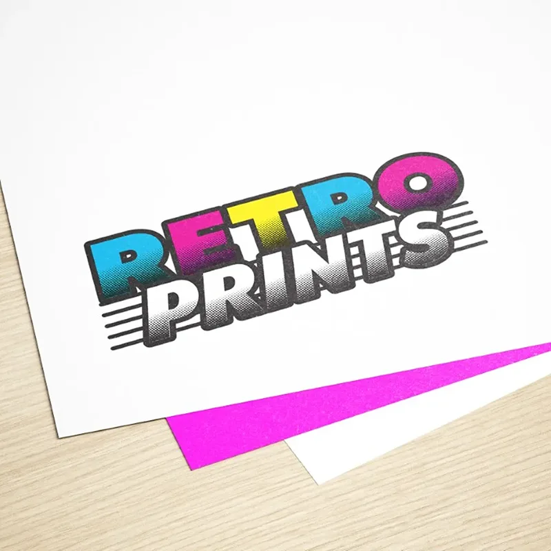
Retro Prints
Retro Prints needed a bold, nostalgic logo that reflects their love for classic films, comics, and print culture. I designed a vibrant, halftone-style typography inspired by vintage comic books and retro posters, using a bright CMYK colour scheme to tie into traditional printing methods. The dynamic slanted text and motion lines add energy, capturing the excitement of limited-edition prints. This logo perfectly blends retro aesthetics with a modern appeal, making it a strong visual identity for the brand and its artist-powered community.
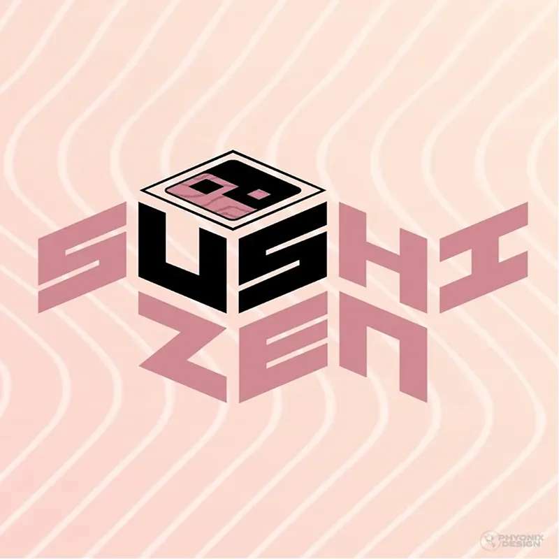
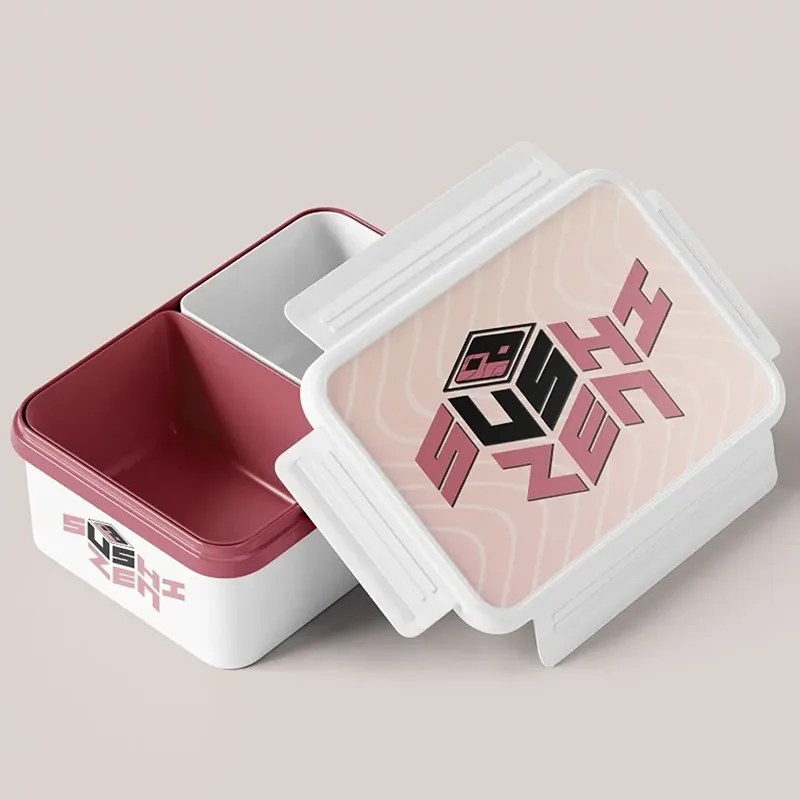
Sushi Zen
Sushi Zen needed a logo that reflects their commitment to traditional, artisanal sushi while maintaining a modern, sophisticated appeal. I created a bold, geometric typeface inspired by Japanese aesthetics, paired with a stylised sushi cube to symbolise precision and craftsmanship. The soft pink and black colour scheme evokes elegance and authenticity, making it ideal for signage, menus, and serveware. This design strikes a balance between tradition and contemporary style, ensuring a strong visual identity for Sushi Zen.
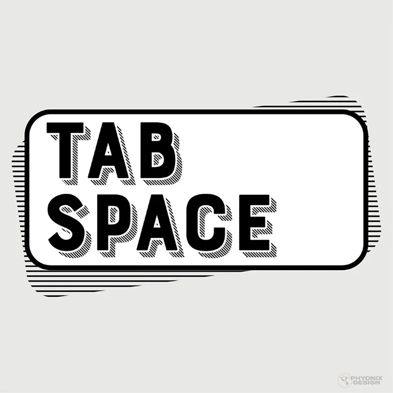
TabSpace
TabSpace required a clean, tech-focused logo that reflects its role in streamlining debugging and developer communication. I designed a bold, structured wordmark with a retro-inspired halftone shading effect, creating a sense of depth and technical precision. The enclosed tab-like shape reinforces the software’s name while maintaining a professional and minimalist aesthetic. The design is versatile, ensuring usability across both website branding and software icons, making it instantly recognisable for startups and engineering teams.
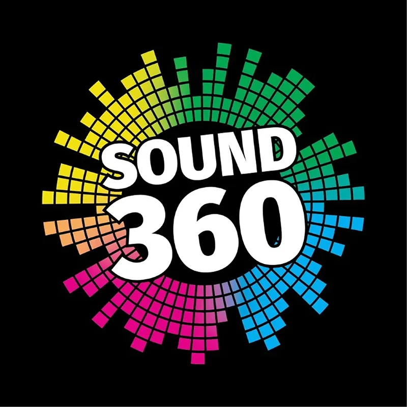
Sound 360
Sound 360 needed a futuristic, immersive logo that reflects their cutting-edge 360-degree audio technology. I designed a circular equaliser pattern, radiating outward to symbolise surround sound and vast spatial depth, making it a perfect fit for their VR and interactive audio focus. The bold, modern sans-serif typography blends sci-fi aesthetics with a clean, tech-forward style. Set against a black background, the vibrant colour spectrum enhances the feeling of dynamic sound waves, making the brand instantly recognisable in conventions and product branding.
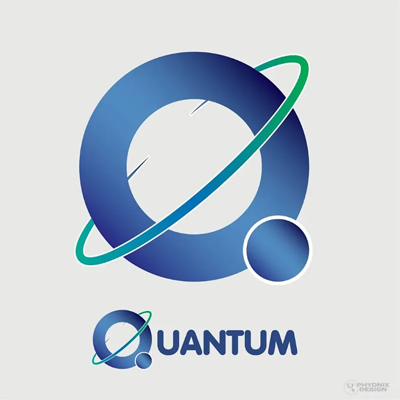
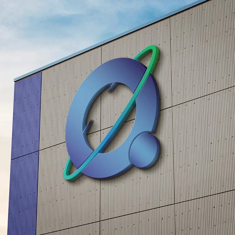
Quantum
Quantum, a high-performance PHP framework, needed a minimalist yet sophisticated logo to reflect its stability, efficiency, and modularity. I designed a sleek, planetary-inspired "Q", symbolising expansion, speed, and the structured nature of the framework. The blue and green gradient conveys trust and innovation, while the clean typography ensures clarity across GitHub repositories and documentation. This professional and understated design aligns with Quantum’s focus on engineering excellence and open-source collaboration.
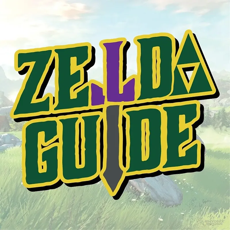
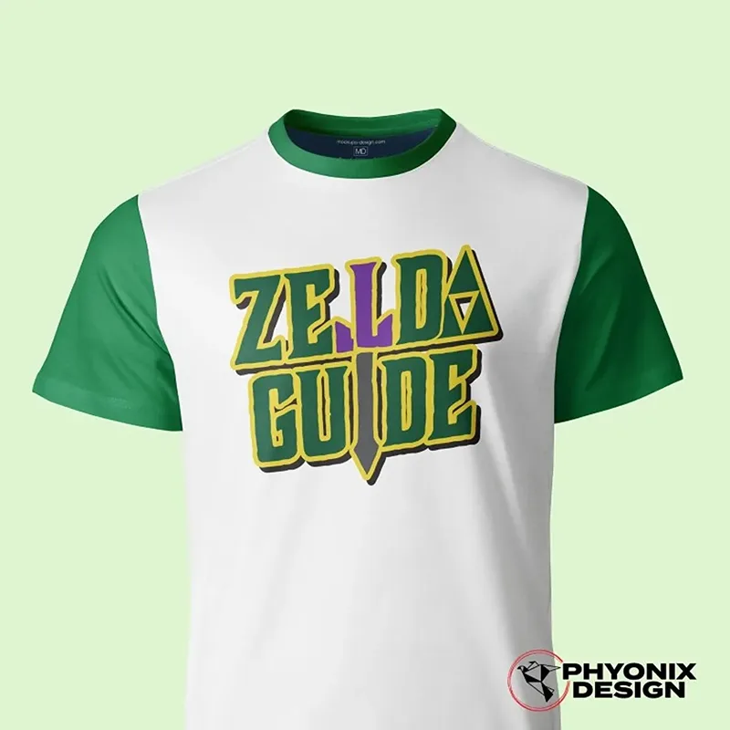
ZeldaGuide
ZeldaGuide needed a distinct, recognisable visual identity that captures the essence of the Zelda franchise while maintaining originality. I designed a custom, bold typeface that avoids direct replication of Zelda’s branding while using familiar colours and stylistic elements to evoke nostalgia. The sword integration within the typography symbolises adventure and guidance, reinforcing the site's mission. The green, gold, and purple palette keeps it visually aligned with the franchise while ensuring adaptability for merchandise and digital branding. This design provides a strong, unique presence for ZeldaGuide’s community and content.